Back to Top Button
A floating button that appears when users scroll down, providing quick navigation back to the top of the page.
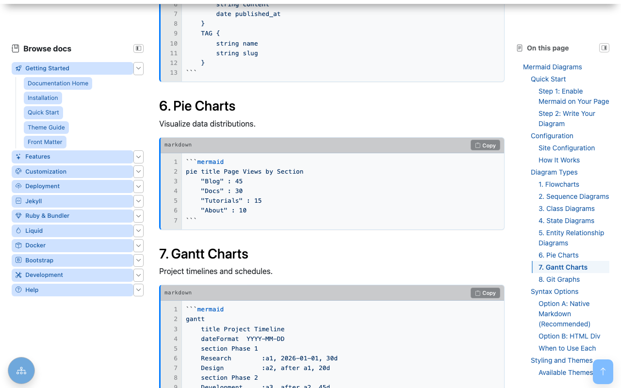
The button stays hidden at the top of the page and fades in once you scroll past the first viewport, so it never gets in the way.
Overview
- Appears on Scroll: Shows after scrolling 200px
- Smooth Animation: Animated scroll to top
- Accessible: Proper button semantics
- Performance: Passive scroll listener
Implementation
HTML Markup
<button id="backToTopBtn"
        class="btn btn-primary rounded-circle position-fixed"
        aria-label="Back to top"
        style="bottom: 20px; right: 20px; display: none; z-index: 1000;">
  <i class="bi bi-arrow-up"></i>
</button>
JavaScript
document.addEventListener('DOMContentLoaded', () => {
  const btn = document.getElementById('backToTopBtn');
  if (!btn) return;

  // Scroll to top
  btn.addEventListener('click', (e) => {
    e.preventDefault();
    window.scrollTo({ top: 0, behavior: 'smooth' });
  });

  // Show/hide based on scroll position
  const toggle = () => {
    const y = window.scrollY || document.documentElement.scrollTop;
    btn.style.display = y > 200 ? 'block' : 'none';
  };

  toggle();
  window.addEventListener('scroll', toggle, { passive: true });
});
Configuration
Scroll Threshold
Adjust when button appears:
Position
#backToTopBtn {
  bottom: 20px;  /* Distance from bottom */
  right: 20px;   /* Distance from right */
}

/* Or use Bootstrap utilities */
.back-to-top {
  bottom: 1rem;
  right: 1rem;
}
Styling
#backToTopBtn {
  width: 48px;
  height: 48px;
  background-color: var(--bs-primary);
  border: none;
  box-shadow: 0 2px 10px rgba(0, 0, 0, 0.2);
  transition: opacity 0.3s ease;
}

#backToTopBtn:hover {
  background-color: var(--bs-primary-dark);
  transform: translateY(-2px);
}
Customization
Different Icons
<!-- Arrow up -->
<i class="bi bi-arrow-up"></i>

<!-- Chevron up -->
<i class="bi bi-chevron-up"></i>

<!-- Caret up -->
<i class="bi bi-caret-up-fill"></i>
With Text
<button id="backToTopBtn" class="btn btn-primary">
  <i class="bi bi-arrow-up me-1"></i>
  Top
</button>
Fade Animation
Accessibility
ARIA Attributes
Focus Visible
Keyboard Support
The button is focusable and activates with Enter/Space.
Performance
Passive Listener
The passive: true option improves scroll performance by indicating the listener won't call preventDefault().
Debouncing (Optional)
For heavy pages, debounce the scroll handler:
function debounce(fn, wait) {
  let timeout;
  return function() {
    clearTimeout(timeout);
    timeout = setTimeout(fn, wait);
  };
}

window.addEventListener('scroll', debounce(toggle, 100), { passive: true });
Mobile Considerations
Touch-Friendly Size
Ensure button meets minimum tap target (44x44px):
Avoid Overlap
Position to not interfere with mobile TOC button:
/* When mobile TOC FAB is present */
@media (max-width: 991px) {
  #backToTopBtn {
    bottom: 80px; /* Above TOC button */
  }
}
Troubleshooting
Button Not Appearing
- Check scroll threshold
- Verify element exists in DOM
- Check z-index conflicts
- Inspect display style
Not Scrolling
- Verify
behavior: 'smooth'support - Check for scroll lock on body
- Test without other scroll scripts
Performance Issues
- Add passive listener option
- Use debouncing
- Reduce scroll threshold checks
Related
See also
- [[Features]]
- [[Keyboard Navigation]]
- [[Mobile TOC Floating Action Button]]